Control charts, also known as Shewhart charts or process-behavior charts, in statistical process control are tools used to determine if a manufacturing or business process is in a state of statistical control.
Overview
If analysis of the control chart indicates that the process is currently under control (i.e., is stable, with variation only coming from sources common to the process), then no corrections or changes to process control parameters are needed or desired. In addition, data from the process can be used to predict the future performance of the process. If the chart indicates that the monitored process is not in control, analysis of the chart can help determine the sources of variation, as this will result in degraded process performance.A process that is stable but operating outside of desired limits (e.g., scrap rates may be in statistical control but above desired limits) needs to be improved through a deliberate effort to understand the causes of current performance and fundamentally improve the process.
The control chart is one of the seven basic tools of quality control. Typically control charts are used for time-series data, though they can be used for data that have logical comparability (i.e. you want to compare samples that were taken all at the same time, or the performance of different individuals), however the type of chart used to do this requires consideration.
History
The control chart was invented by Walter A. Shewhart while working for Bell Labs in the 1920s. The company’s engineers had been seeking to improve the reliability of their telephony transmission systems. Because amplifiers and other equipment had to be buried underground, there was a business need to reduce the frequency of failures and repairs. By 1920, the engineers had already realized the importance of reducing variation in a manufacturing process. Moreover, they had realized that continual process-adjustment in reaction to non-conformance actually increased variation and degraded quality. Shewhart framed the problem in terms of Common- and special-causes of variation and, on May 16, 1924, wrote an internal memo introducing the control chart as a tool for distinguishing between the two. Dr. Shewhart’s boss, George Edwards, recalled: “Dr. Shewhart prepared a little memorandum only about a page in length. About a third of that page was given over to a simple diagram which we would all recognize today as a schematic control chart. That diagram, and the short text which preceded and followed it set forth all of the essential principles and considerations which are involved in what we know today as process quality control.”[5] Shewhart stressed that bringing a production process into a state of statistical control, where there is only common-cause variation, and keeping it in control, is necessary to predict future output and to manage a process economically.
Dr. Shewhart created the basis for the control chart and the concept of a state of statistical control by carefully designed experiments. While Dr. Shewhart drew from pure mathematical statistical theories, he understood data from physical processes typically produce a “normal distribution curve” (a Gaussian distribution, also commonly referred to as a “bell curve“). He discovered that observed variation in manufacturing data did not always behave the same way as data in nature (Brownian motion of particles). Dr. Shewhart concluded that while every process displays variation, some processes display controlled variation that is natural to the process, while others display uncontrolled variation that is not present in the process causal system at all times.
In 1924 or 1925, Shewhart’s innovation came to the attention of W. Edwards Deming, then working at the Hawthorne facility. Deming later worked at the United States Department of Agriculture and became the mathematical advisor to the United States Census Bureau. Over the next half a century, Deming became the foremost champion and proponent of Shewhart’s work. After the defeat of Japan at the close of World War II, Deming served as statistical consultant to the Supreme Commander for the Allied Powers. His ensuing involvement in Japanese life, and long career as an industrial consultant there, spread Shewhart’s thinking, and the use of the control chart, widely in Japanese manufacturing industry throughout the 1950s and 1960s.
Chart details
A control chart consists of:
- Points representing a statistic (e.g., a mean, range, proportion) of measurements of a quality characteristic in samples taken from the process at different times [the data]
- The mean of this statistic using all the samples is calculated (e.g., the mean of the means, mean of the ranges, mean of the proportions)
- A centre line is drawn at the value of the mean of the statistic
- The standard error (e.g., standard deviation/sqrt(n) for the mean) of the statistic is also calculated using all the samples
- Upper and lower control limits (sometimes called “natural process limits”) that indicate the threshold at which the process output is considered statistically ‘unlikely’ and are drawn typically at 3 standard errors from the centre line
The chart may have other optional features, including:
- Add MediaUpper and lower warning limits, drawn as separate lines, typically two standard errors above and below the centre line
- Division into zones, with the addition of rules governing frequencies of observations in each zone
Annotation with events of interest, as determined by the Quality Engineer in charge of the process’s quality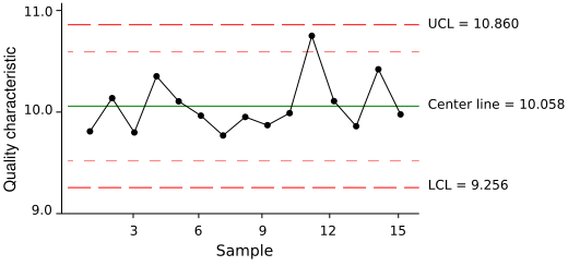
Chart usage
If the process is in control (and the process statistic is normal), 99.7300% of all the points will fall between the control limits. Any observations outside the limits, or systematic patterns within, suggest the introduction of a new (and likely unanticipated) source of variation, known as a special-cause variation. Since increased variation means increased quality costs, a control chart “signaling” the presence of a special-cause requires immediate investigation.
This makes the control limits very important decision aids. The control limits provide information about the process behavior and have no intrinsic relationship to any specification targets or engineering tolerance. In practice, the process mean (and hence the centre line) may not coincide with the specified value (or target) of the quality characteristic because the process’ design simply cannot deliver the process characteristic at the desired level.
Control charts limit specification limits or targets because of the tendency of those involved with the process (e.g., machine operators) to focus on performing to specification when in fact the least-cost course of action is to keep process variation as low as possible. Attempting to make a process whose natural centre is not the same as the target perform to target specification increases process variability and increases costs significantly and is the cause of much inefficiency in operations. Process capability studies do examine the relationship between the natural process limits (the control limits) and specifications, however.
The purpose of control charts is to allow simple detection of events that are indicative of actual process change. This simple decision can be difficult where the process characteristic is continuously varying; the control chart provides statistically objective criteria of change. When change is detected and considered good its cause should be identified and possibly become the new way of working, where the change is bad then its cause should be identified and eliminated.
The purpose in adding warning limits or subdividing the control chart into zones is to provide early notification if something is amiss. Instead of immediately launching a process improvement effort to determine whether special causes are present, the Quality Engineer may temporarily increase the rate at which samples are taken from the process output until it’s clear that the process is truly in control. Note that with three-sigma limits, common-cause variations result in signals less than once out of every twenty-two points for skewed processes and about once out of every three hundred seventy (1/370.4) points for normally distributed processes. The two-sigma warning levels will be reached about once for every twenty-two (1/21.98) plotted points in normally distributed data. (For example, the means of sufficiently large samples drawn from practically any underlying distribution whose variance exists are normally distributed, according to the Central Limit Theorem.)

